Responsive Vs Adaptive Design
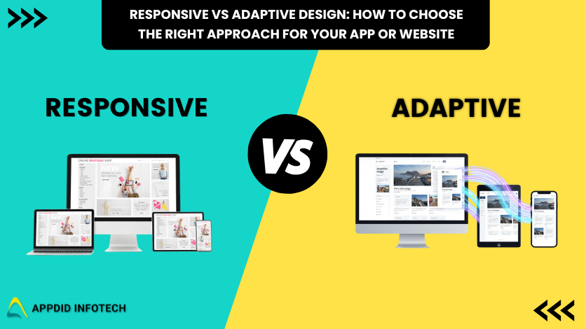
Responsive vs Adaptive Design: How to Choose the Right Approach for Your App or Website
Introduction
In today’s multi-device world, users expect smooth experiences whether they are browsing on a phone, tablet, or desktop. For designers and developers, the challenge is clear: how do you create a single design that performs beautifully on every screen size?
That is where responsive and adaptive design come in. Both methods aim to optimize usability and layout across devices, but they take different approaches. Choosing the right one can directly impact your website’s performance, user satisfaction, and SEO.
In this blog, we will explore the difference between responsive and adaptive design, discuss their advantages and drawbacks, and help you decide which strategy is best for your app or website. You will also learn how Appdid, a leading web development company in Mumbai, can help you build the perfect solution.
What Is Responsive Design?
Responsive design is a flexible approach where the layout automatically adjusts to the screen size and orientation of the user’s device. It uses CSS media queries, flexible grids, and fluid images to ensure your content looks great on all screens.
Key Features of Responsive Design:
-
One dynamic layout that adapts to any screen size
-
Uses flexible grids and breakpoints
-
Automatically adjusts spacing, fonts, and images
-
Easier to maintain with a single codebase
Example:
When you resize a responsive website in your browser window, you will see how the text and images smoothly reposition themselves. Sites like Shopify and Dropbox are great examples of responsive design.
What Is Adaptive Design?
Adaptive design uses multiple fixed layouts tailored for specific screen widths. Instead of one layout that resizes fluidly, it detects the user’s device and serves a layout designed for that screen.
Key Features of Adaptive Design:
-
Multiple static layouts for different screen sizes
-
More control over how content appears on each device
-
Optimized performance for specific screen resolutions
-
Requires more time to develop and maintain
Example:
Some airline or banking websites use adaptive design. Their mobile and desktop versions look very different because each is designed separately to suit its audience.
Responsive vs Adaptive Design: Key Differences
|
Feature |
Responsive Design |
Adaptive Design |
|
Layout |
Fluid and flexible |
Fixed for specific screen sizes |
|
Codebase |
One unified design |
Multiple versions |
|
Performance |
Slightly slower on mobile due to scaling |
Optimized for each device |
|
Maintenance |
Easier to maintain |
More complex |
|
Design Control |
Limited control per screen size |
Full control per device |
|
SEO Benefits |
Google-preferred and mobile-friendly |
May require extra SEO work |
Advantages of Responsive Design
-
Cost-effective because one design works everywhere
-
Google recommends it for SEO and mobile-first indexing
-
Consistent user experience across all devices
-
Automatically supports new devices as they appear
Best For:
Businesses and startups that want a single, scalable, and easy-to-manage solution.
Advantages of Adaptive Design
-
Optimized loading speed for specific devices
-
Full control over user experience on each device
-
Better accessibility for older devices
-
Ideal for complex apps with heavy user interfaces
Best For:
Large-scale applications or brands that want highly customized layouts for each platform.
When to Choose Responsive Design
Choose responsive design if:
-
You are creating a new website or redesigning an old one
-
You want strong SEO and better mobile usability
-
You prefer simplicity and easier management
-
Your audience uses many different devices
Responsive design is the right choice for long-term flexibility and consistent experiences.
When to Choose Adaptive Design
Choose adaptive design if:
-
You already have a desktop site and want to optimize for mobile
-
You need different experiences for mobile and desktop users
-
Your platform relies on complex or data-heavy interfaces
-
You want precise control over layout and performance
Adaptive design is ideal for established brands that value performance and fine-tuned user experiences.
Hybrid Approach: The Best of Both
Many developers now combine both methods. You can use a responsive layout with adaptive elements, such as serving optimized images or specific UI components for different devices.
This hybrid method provides the flexibility of responsive design with the speed and precision of adaptive design.
The Future of Web and App Design
The future of web development is moving toward intelligent and adaptive systems. Technologies such as AI-driven design tools, progressive web apps (PWAs), and Web 3.0 frameworks are helping developers create smart, context-aware websites that adapt in real time.
Soon, websites and apps will not only respond to screen sizes but also user behavior, preferences, and intent.
FAQs
1. Which is better: responsive or adaptive design?
It depends on your project. Responsive design is simpler and more cost-effective, while adaptive design offers better speed and control.
2. Does Google prefer responsive design?
Yes. Google recommends responsive design for better SEO and consistent mobile indexing.
3. Can responsive and adaptive techniques be combined?
Yes. A hybrid model can deliver flexible layouts while keeping performance optimized.
4. Is adaptive design better for apps?
Adaptive design works best for applications that need tailored experiences and advanced user interfaces.
5. How can I make my website mobile-friendly easily?
Partner with a professional web development company like Appdid in Mumbai. Our experts can design responsive or adaptive layouts based on your goals.
Conclusion: Choose Smart with Appdid
Both responsive and adaptive design play key roles in creating successful digital experiences. Responsive design offers scalability and SEO advantages, while adaptive design provides precision and performance.
At Appdid, we help businesses choose and implement the best design strategy for their goals. As a leading web and app development company in Thane, Mumbai, our team specializes in creating beautiful, device-friendly websites and applications that perform flawlessly.
If you are ready to build a smarter, faster, and future-proof digital presence, contact Appdid today. Let’s create your next great experience together.